Raw spatial data tells you nothing. A spreadsheet of coordinates, a database of polygons, a CSV of addresses—they're just numbers until you visualize them. The right visualization transforms location data into insights, patterns, and stories that drive decisions.
In 2026, geospatial visualization tools have become remarkably sophisticated. You can render millions of points in real-time, create stunning 3D cityscapes, animate temporal data, and build interactive dashboards—often without writing a single line of code.
Here's our guide to the best geospatial data visualization tools available in 2026.
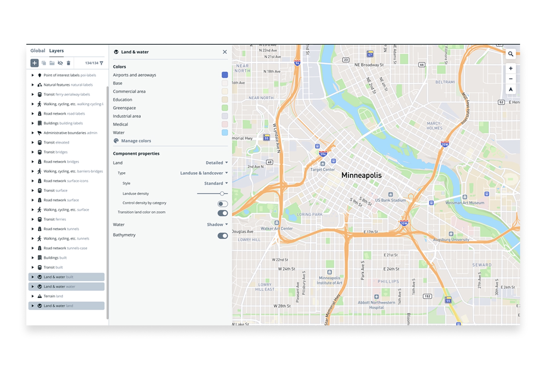
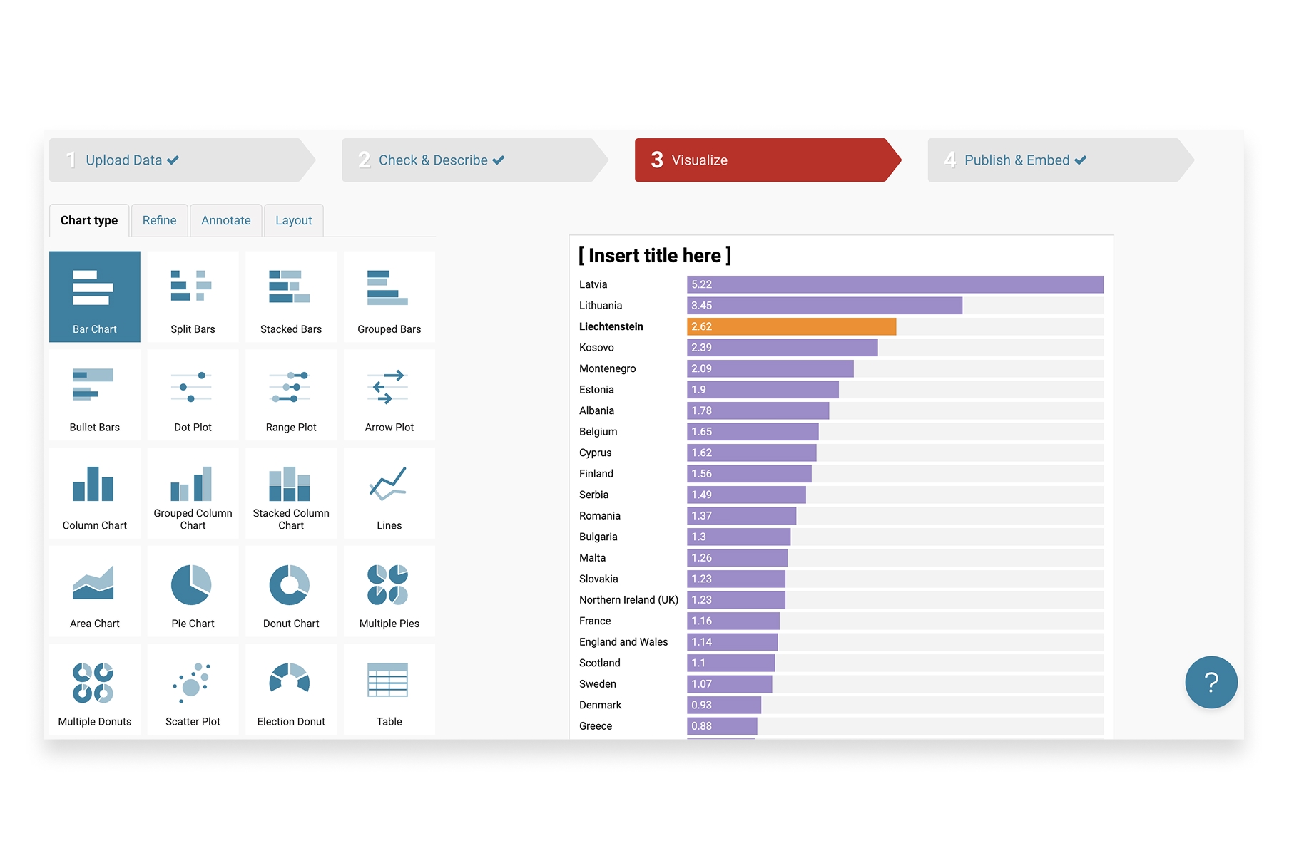
1. Atlas
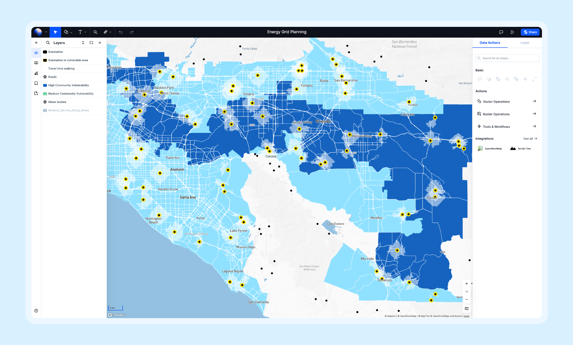
Atlas combines powerful visualization capabilities with an intuitive interface that makes spatial data accessible to everyone. It excels at transforming raw data into interactive, shareable maps with real-time collaboration built in.
- Features: Choropleth maps, point clusters, heatmaps, 3D extrusions, time-series animation, AI-powered styling suggestions, real-time collaboration, and dozens of data format imports.
- Best For: Teams that need to visualize, analyze, and share spatial data without GIS expertise.
- Pros: Beautiful default styling, intuitive interface, real-time collaboration, handles large datasets, browser-based.
- Cons: Some advanced visualization types require paid plans.
- Pricing: Free tier available, Pro from $29/month.
- Website: Atlas
2. Kepler.gl
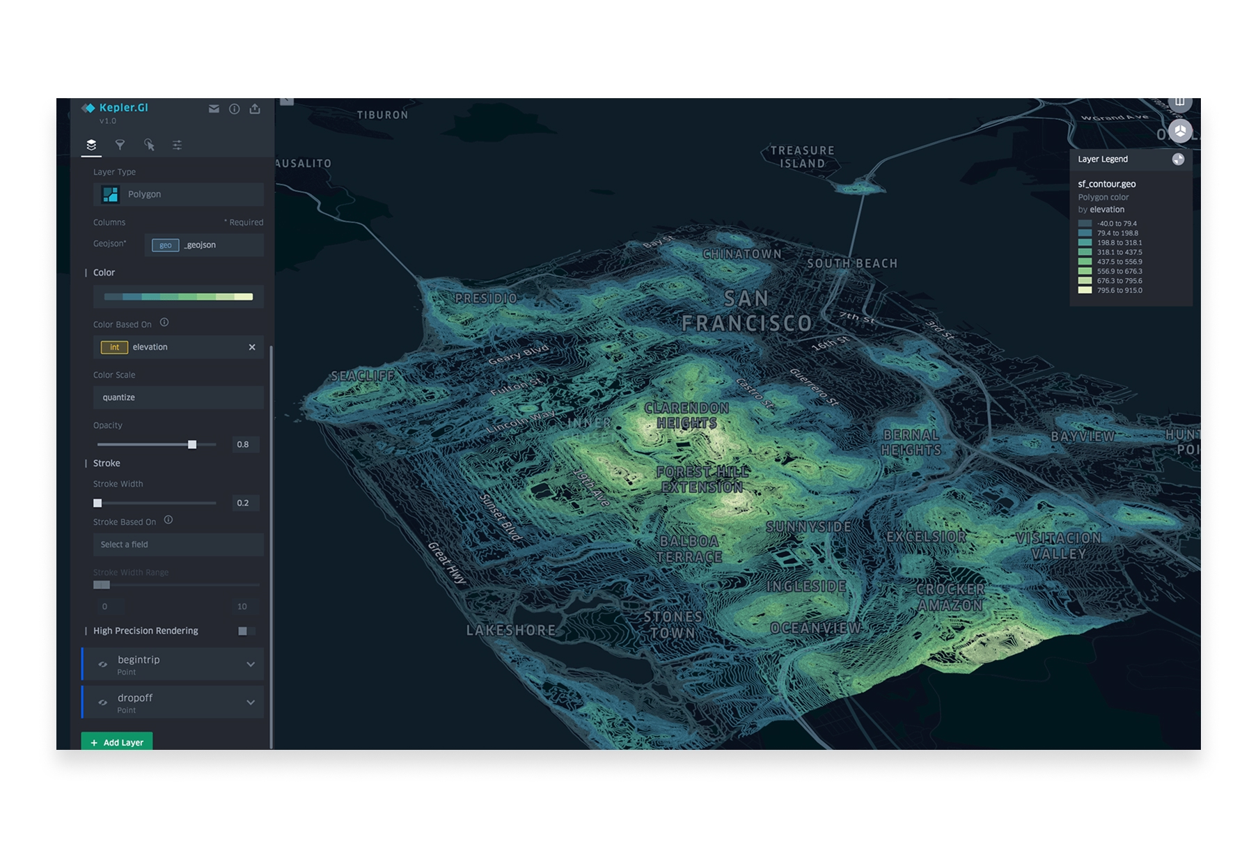
Kepler.gl is Uber's open-source geospatial visualization tool, designed to handle massive datasets with stunning performance. It's become the go-to tool for data scientists working with location data.
- Features: Point maps, arc layers, hexbins, heatmaps, 3D views, time-series animations, trip visualization, filtering, and aggregation—all running on GPU-accelerated WebGL.
- Best For: Data scientists and analysts visualizing large-scale spatial datasets.
- Pros: Handles millions of points, stunning visuals, completely free, open-source, no installation required.
- Cons: No data persistence, requires some technical comfort, visualization-only (no analysis).
- Pricing: Free and open-source.
- Website: Kepler.gl
3. Mapbox Studio
Mapbox Studio is the professional's choice for custom map design. It gives you pixel-level control over every aspect of your map's appearance, from road widths to building colors to label placement.
- Features: Custom basemap styling, data visualization layers, 3D terrain, dynamic data-driven styling, real-time updates, and seamless integration with web applications.
- Best For: Designers and developers creating branded, custom map experiences.
- Pros: Unmatched styling control, beautiful defaults, excellent documentation, strong ecosystem.
- Cons: Learning curve for advanced features, usage-based pricing at scale, requires technical knowledge for full potential.
- Pricing: Free tier with generous limits, pay-as-you-go for higher usage.
- Website: Mapbox
4. Deck.gl

Deck.gl is a WebGL-powered framework for large-scale data visualization. Built by the team behind Kepler.gl, it's the engine that powers many of the most impressive web-based spatial visualizations.
- Features: 60+ layer types, GPU-accelerated rendering, 3D visualization, temporal data support, integration with React and other frameworks.
- Best For: Developers building custom visualization applications that need to handle massive datasets.
- Pros: Incredible performance, highly customizable, open-source, active development, great documentation.
- Cons: Requires JavaScript development skills, steeper learning curve.
- Pricing: Free and open-source.
- Website: Deck.gl
5. Tableau
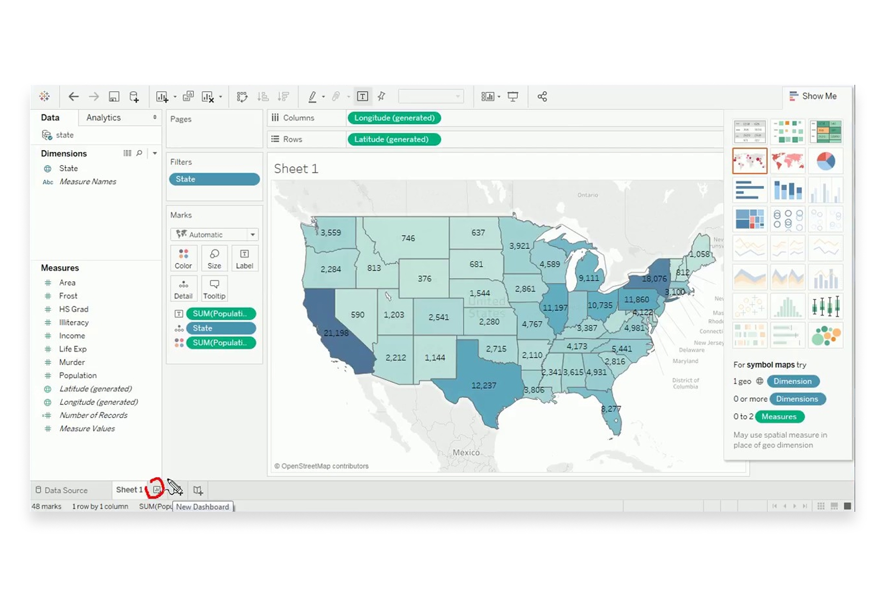
Tableau is a leading business intelligence platform with robust mapping capabilities. Its strength lies in combining spatial visualization with other data types in interactive dashboards.
- Features: Built-in geocoding, density maps, spatial calculations, dashboard integration, Mapbox integration for custom basemaps, and connection to virtually any data source.
- Best For: Business analysts creating executive dashboards that include geographic insights.
- Pros: Powerful BI integration, excellent for dashboards, handles multiple data sources, strong enterprise support.
- Cons: Expensive licensing, maps are secondary to general BI features, limited advanced spatial analysis.
- Pricing: Creator from $75/month, enterprise pricing varies.
- Website: Tableau
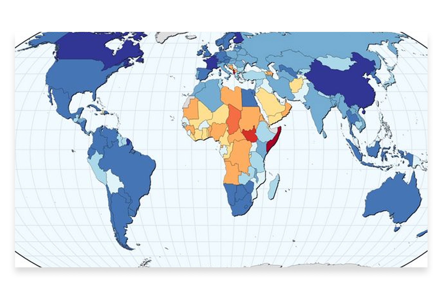
6. Flourish
Flourish specializes in creating beautiful, animated data visualizations for storytelling. Its mapping templates make it easy to create publication-ready geographic visualizations without coding.
- Features: Choropleth maps, point maps, 3D maps, animated transitions, projection globe, embedded stories, and easy data binding.
- Best For: Journalists, marketers, and communicators creating visual stories with geographic data.
- Pros: Beautiful templates, no coding required, excellent for storytelling, easy embedding, animated transitions.
- Cons: Template-based (limited customization), some features require paid plans.
- Pricing: Free tier available, Business from $63/month.
- Website: Flourish
7. Power BI

Microsoft Power BI offers multiple mapping visuals for business intelligence. It's deeply integrated with the Microsoft ecosystem and excels at enterprise reporting with geographic dimensions.
- Features: Bing Maps integration, ArcGIS Maps visual, shape maps, filled maps, Azure Maps integration, and real-time data refresh.
- Best For: Organizations already using Microsoft tools that need geographic reporting.
- Pros: Deep Microsoft integration, enterprise-ready, good for dashboards, familiar interface for Office users.
- Cons: Maps are basic compared to dedicated tools, limited spatial analysis, Azure dependency for advanced features.
- Pricing: Free tier, Pro at $10/user/month, Premium varies.
- Website: Power BI
8. Observable
Observable is a JavaScript notebook platform popular with data visualization practitioners. It's become a hub for innovative spatial visualizations, with a community sharing cutting-edge techniques.
- Features: Live code notebooks, D3.js and Deck.gl integration, community templates, reactive programming, easy embedding, and collaboration features.
- Best For: Data visualization developers and practitioners exploring new visualization techniques.
- Pros: Cutting-edge visualizations, active community, great for learning, shareable notebooks.
- Cons: Requires coding skills, steeper learning curve, more experimental than production-ready.
- Pricing: Free tier, Teams from $15/user/month.
- Website: Observable
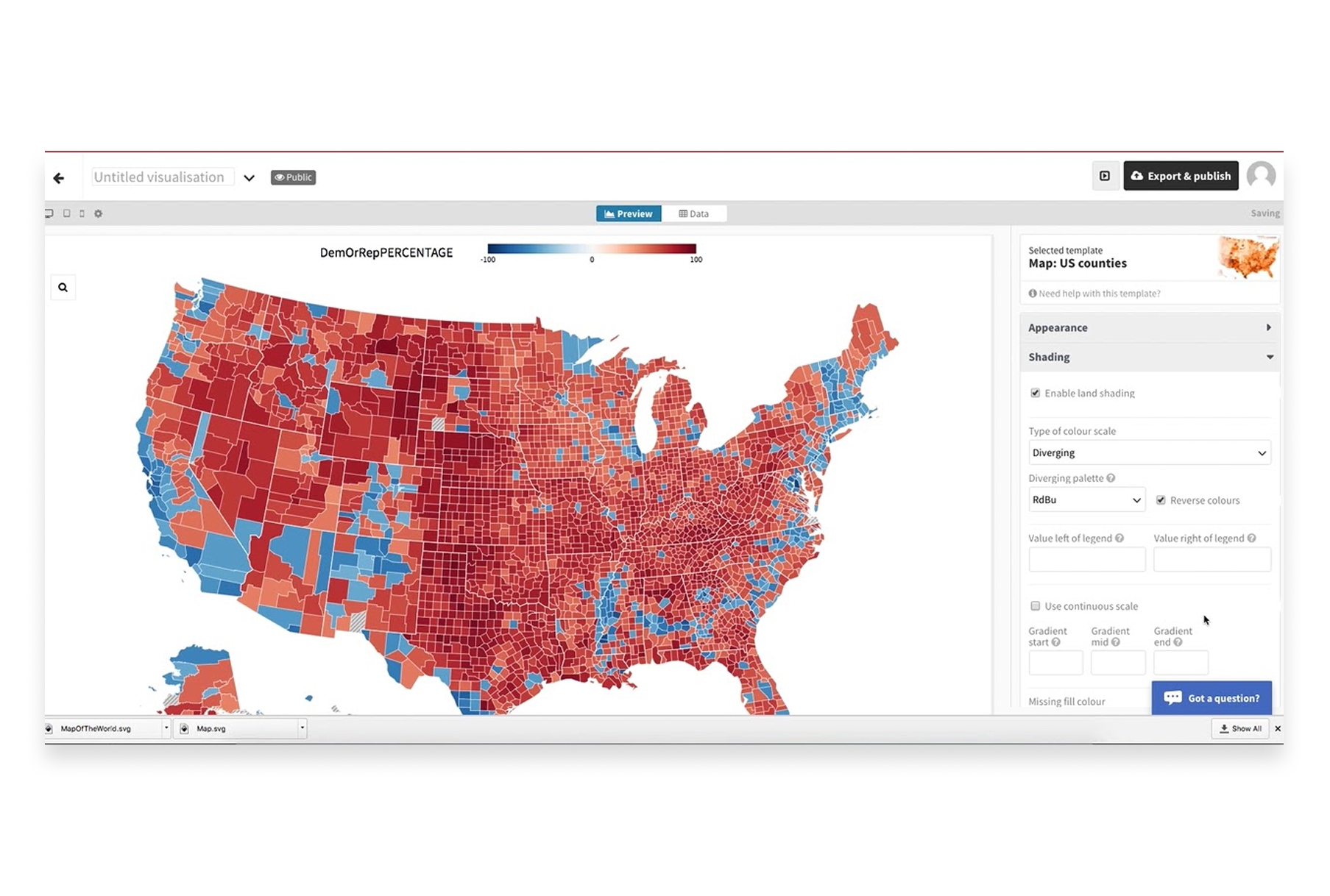
9. Datawrapper
Datawrapper is the tool of choice for newsrooms worldwide. It creates clean, publication-ready maps that look great in articles and reports without requiring design or coding skills.
- Features: Choropleth maps, symbol maps, locator maps, responsive embeds, annotation tools, custom color scales, and automatic legend generation.
- Best For: Journalists, publishers, and communicators creating maps for articles and reports.
- Pros: Publication-ready output, very easy to use, responsive design, trusted by major newsrooms.
- Cons: Limited map types, customization constraints, focused on editorial use cases.
- Pricing: Free tier, Custom from $599/month.
- Website: Datawrapper
10. CARTO
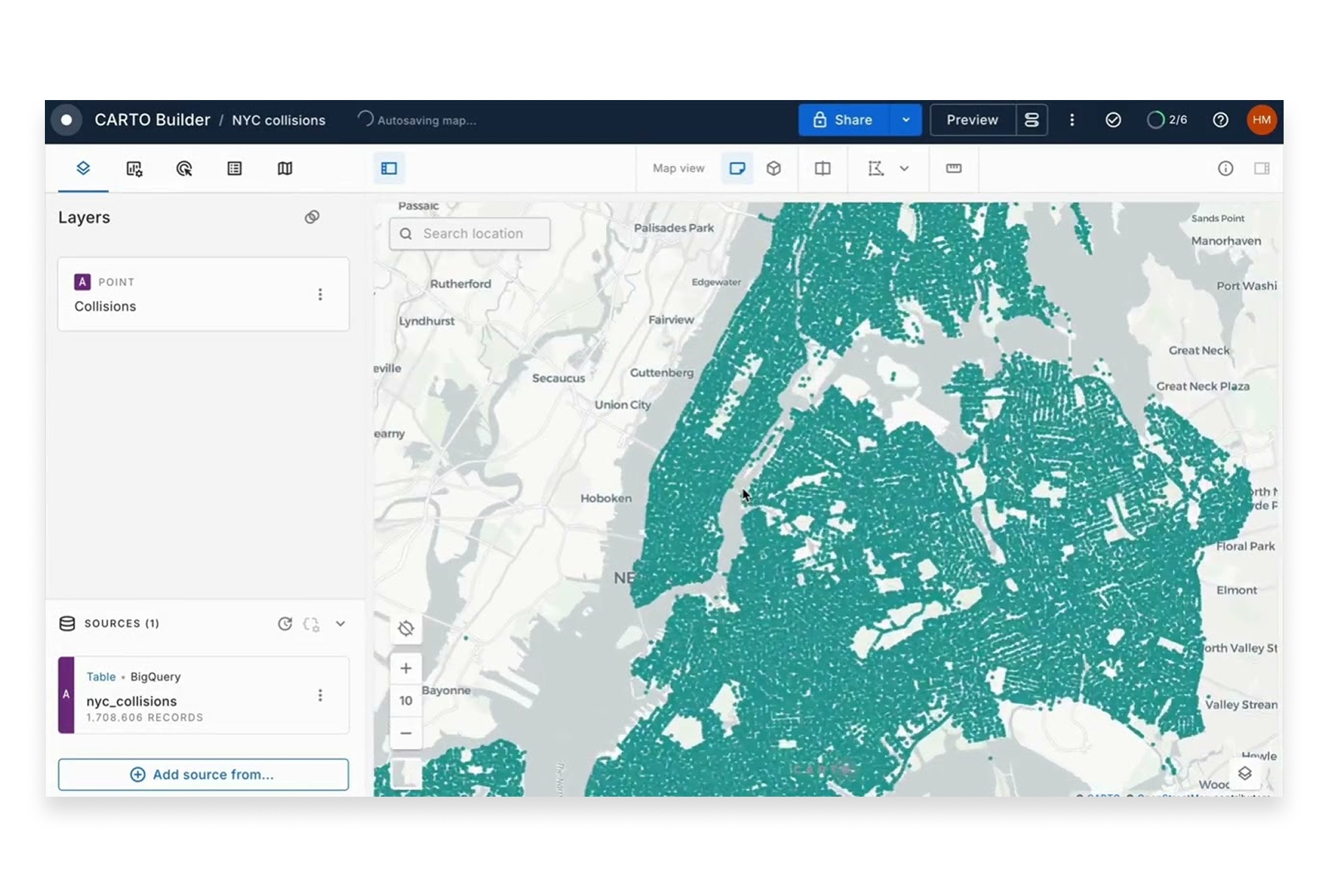
CARTO combines spatial data visualization with location analytics. It's designed for business users who need to create beautiful maps while also running spatial analysis on their data.
- Features: Data visualization, spatial analysis, data enrichment, workflow automation, BigQuery integration, and custom application building.
- Best For: Enterprise teams combining visualization with spatial analytics.
- Pros: Strong visualization plus analysis, data enrichment options, cloud-native architecture.
- Cons: Enterprise pricing, can be complex, some features require SQL knowledge.
- Pricing: Custom enterprise pricing.
- Website: CARTO
Choosing the Right Visualization Tool
The best tool depends on your role and requirements:
- For collaborative team visualization: Atlas offers the best combination of power, ease of use, and real-time collaboration.
- For massive datasets: Kepler.gl and Deck.gl handle millions of points with GPU acceleration.
- For custom-styled maps: Mapbox Studio provides pixel-perfect control over every visual element.
- For business dashboards: Tableau and Power BI integrate maps into broader analytics workflows.
- For storytelling and publishing: Flourish and Datawrapper create publication-ready visualizations.
- For custom development: Deck.gl and Observable enable cutting-edge, bespoke visualizations.
The Art and Science of Spatial Visualization
Effective geospatial visualization is both technical and creative. The best tools in 2026 handle the technical complexity—rendering performance, data processing, coordinate systems—so you can focus on the creative challenge: turning location data into insight.
Whether you're visualizing urban mobility patterns, mapping customer locations, or illustrating climate change impacts, the right visualization tool transforms abstract data into understanding. Choose based on your audience, your data scale, and how much control you need over the final result.