Create heatmaps
Map data density and identify patterns in minutes with Atlas’ intuitive heatmap tool

What is a heatmap?
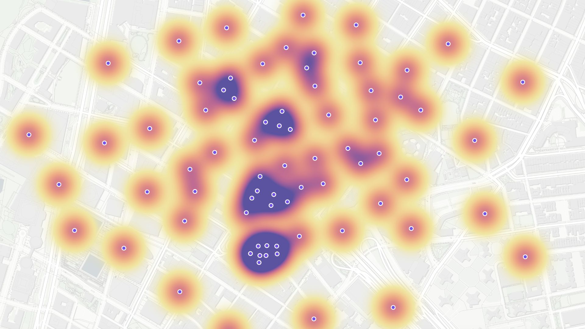
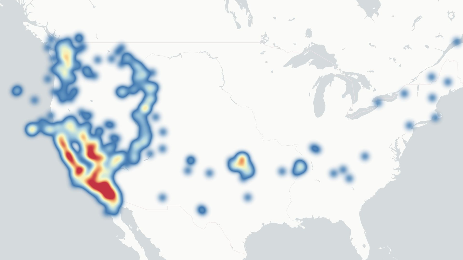
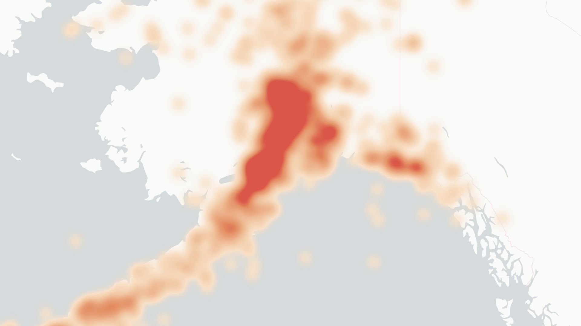
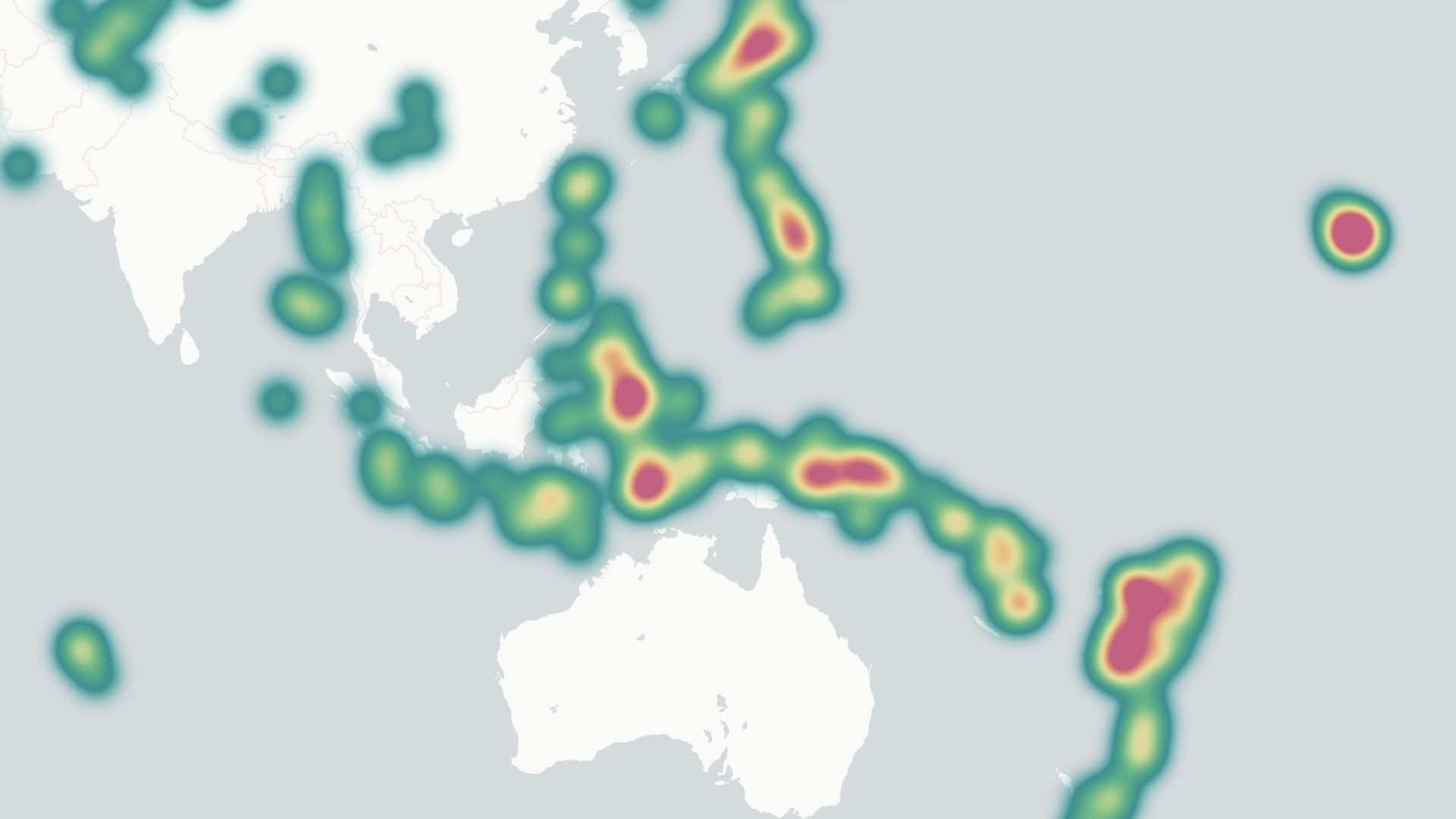
A heatmap visually represents data density using colors. It highlights where data points are concentrated, showing patterns, trends, or anomalies. Common in analytics, it's useful for sales performance, customer insights, or visualizing geographical data.
Create your first heatmap

Examples of heatmaps
Customer distribution
Locate high concentrations of customers to focus marketing efforts
Sales density
See which regions perform best and where improvements are needed
Event attendance
Analyze areas with the most participants for better event planning
How to create heatmaps?
Select data source
Upload your data or connect to an existing source, such as a CRM or database.
Choose heatmap style
Pick from various color schemes to match your data's focus and readability.
Adjust intensity settings
Fine-tune opacity, radius, and weight for clear patterns.
Save and share
Download your map or share a link directly from Atlas.
Why choose Atlas for heatmaps?
Atlas makes creating heatmaps easy and highly customizable. Try out advanced features too.
Export high-quality maps
Download your map in multiple formats with no quality loss.
Integration-friendly
Connect with tools like Google Sheets, Salesforce, and more.
Real-time updates
See your data visualized as it changes.
Interactive visualization
Hover and click to explore data points in detail.
Custom branding
Add your logo and style for a professional touch.
Access from anywhere
Create and view maps on any device with an internet connection.
Frequently asked questions
Learn more about creating and using heatmaps.
