
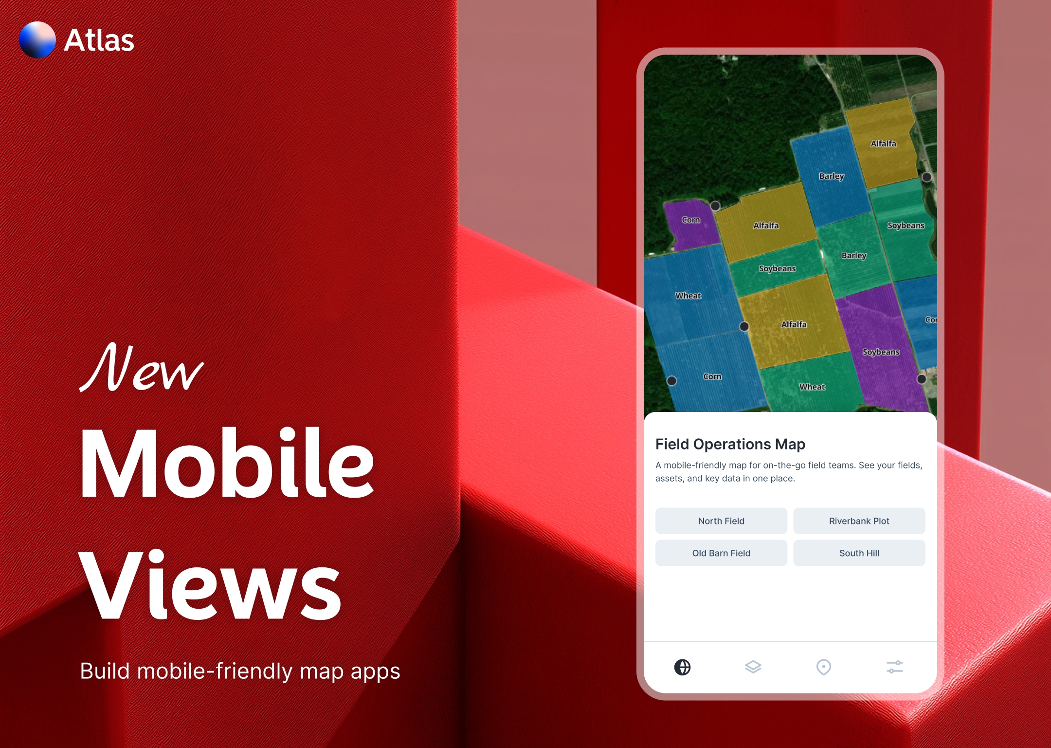
At Atlas, we understand the importance of accessibility and user experience. That’s why we’re excited to announce the launch of Mobile View in our Builder. This new feature empowers you to create responsive, mobile-friendly map applications effortlessly.
What is Mobile View?
Mobile View is a new feature inside the Atlas Builder.
It lets you create fully responsive, mobile-friendly map applications — complete with a bottom navigation bar for switching between pages.
So now, when someone opens your map on their phone, it feels like an actual app.
Who is this for?
Mobile View is for anyone building maps meant to be used in the field or on the go.
If your audience includes:
- Field staff
- Public users
- Community members
- Decision makers in meetings
Then this feature is for you.
It makes maps feel more like apps — clean, simple, and easy to navigate.
A Better Experience on Every Device
Until now, multi-page maps worked best on desktop.
Mobile View changes that.
Now your map can have:
- Multiple pages
- A bottom nav bar
- Touch-friendly layouts
- Clean transitions
It works right out of the box.
You don’t need to do anything fancy. Just toggle on Mobile View in the Builder and customize your navigation.
Key Features
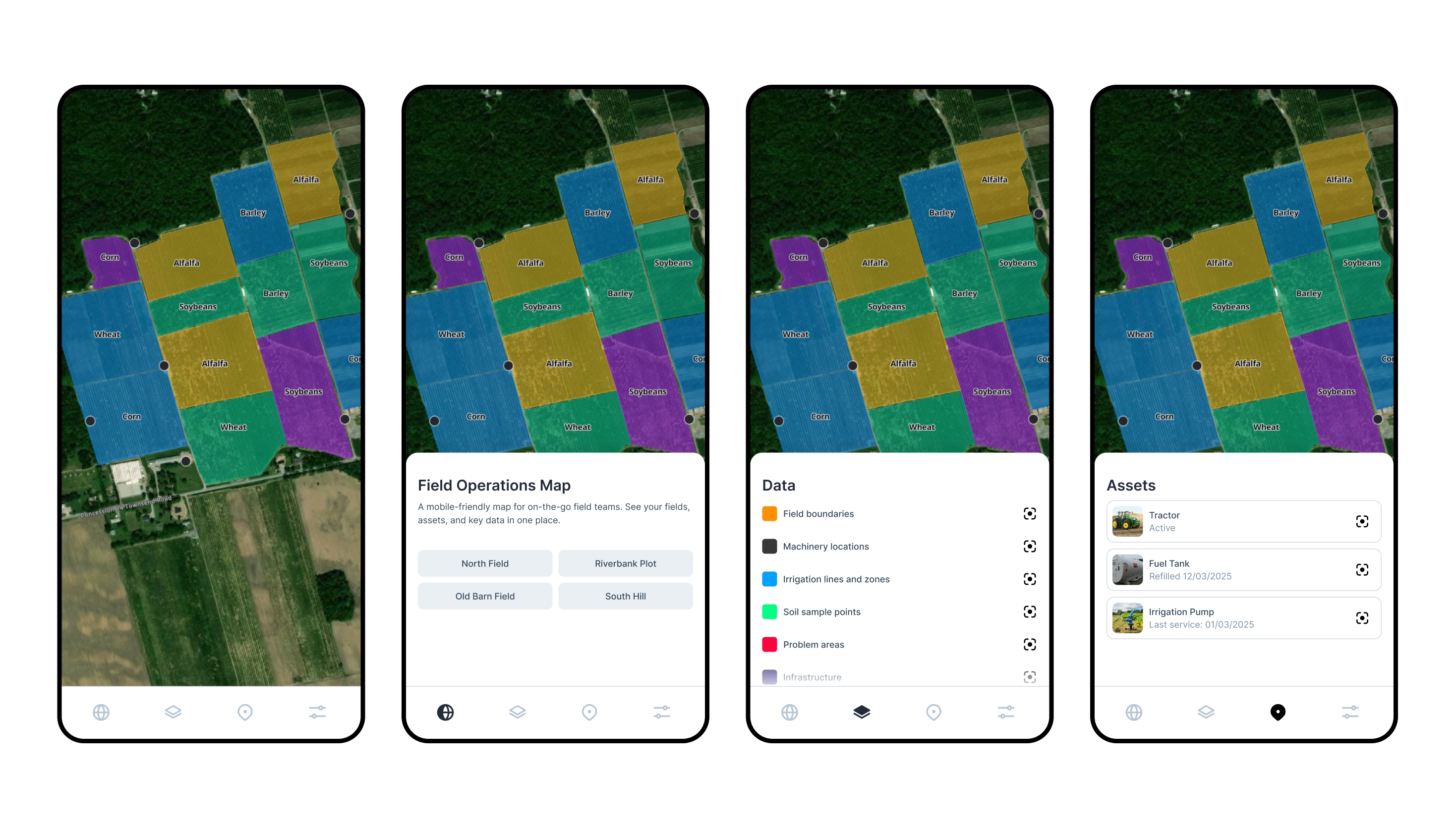
Bottom Navigation Bar
Add a bottom nav bar with icons and labels for each page.
It’s familiar — like the apps everyone already uses.
Tap to switch between pages. It just works.
Fully Responsive Layout
Your app adjusts to fit the screen, whether it’s a phone, tablet, or desktop.
No need to design separately for each device.
No Extra Setup
Mobile View is built into the Atlas Builder.
Just turn it on and organize your pages.
That’s it.
Use it for maps, dashboards, embeds, or any other widget in your project.
Everything stays connected and in sync.
Example Use Cases
Field Operations
Your field team can open the app on their phones, check the map, submit updates, and navigate between views — all with one hand.
Public-Facing Maps
If you’re sharing maps with a community, Mobile View makes it easier for people to engage, even if they’re not sitting at a computer.
Internal Dashboards
Managers checking dashboards on the train? No problem. Everything fits and flows properly on mobile.
Built for Teams
Multiple people working on one app?
You can collaborate in the Builder just like before. Mobile View is just another option in your toolkit.
Decide how your pages are structured, add the right icons, preview the experience, and publish.
Your users get a clean, mobile-friendly experience — instantly.
How to Use It
- Open your project in the Builder
- Turn on Mobile View in the settings
- Add icons and labels to each page
- Rearrange the order if needed
- Preview it on mobile
- Publish
No coding. No extra tools. No hassle.

