

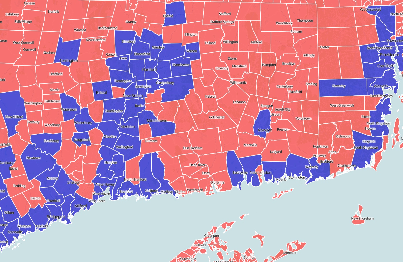
Creating an interactive electoral map is an exciting way to visualize voting trends and demographic distributions. By following a few straightforward steps and utilizing the right tools, you can craft a dynamic map that effectively communicates complex electoral data.
Why Use an Interactive Electoral Map?
Interactive maps allow users to explore data in an intuitive way, offering clickable layers, zooming features, and dynamic updates that static maps simply can't provide. These tools are invaluable for educators, analysts, journalists, and political enthusiasts seeking to dive deeper into electoral patterns.
Tools You Might Need
Before diving into the creation process, it's essential to pick the right tools. Here are some popular choices:
- Atlas: A browser-based mapping tool that's easy to use for quick professional-looking maps.
- Mapbox: Offers customizable design, making it ideal for developers and designers.
- Tableau: Known for its powerful data visualization capabilities, including real-time data updates.
- QGIS: A feature-rich, open-source platform best for those with a bit of GIS experience.
These tools provide various levels of complexity, from user-friendly interfaces for beginners to advanced functionalities for experienced users. Choose one that aligns with your skill level and project needs.
Step 1: Define Your Objectives
Begin by clarifying the purpose of your map. What story are you trying to tell? Is it to showcase voter turnout in different regions, the change in voting patterns over time, or the correlation between demographics and voting behaviors? Having a clear objective will guide your data collection and visualization process.
Step 2: Gather Your Data
Data is the backbone of any map. For electoral maps, you'll need:
- Electoral Data: This includes historical voting results, turnout statistics, and demographic information.
- Geographic Data: Obtain shapefiles or GeoJSON files of electoral boundaries, such as districts or precincts.
Several sources provide electoral and geographic data, including government websites, academic institutions, and various public datasets.
Step 3: Prepare Your Data
Once you have your data, it's time to clean and prepare it:
- Verify Data Accuracy: Check for and correct any inaccuracies.
- Organize Data: Ensure your data is structured in a way that's compatible with your mapping tool. This may involve converting file formats or reconciling data attributes.
Step 4: Choose Your Mapping Platform
With your data ready, choose a mapping platform that suits your project's needs. Here are the capabilities of some tools:
- Atlas: Simplifies the process of creating interactive maps with a user-friendly, browser-based interface.
- Mapbox: Offers customization options for a distinctive look.
- QGIS: Perfect for detailed spatial analyses and can handle various data formats.
Download or open the chosen platform, set up your project, and import your data.
Step 5: Design the Map
Design is crucial for clarity and engagement. Consider the following:
- Layers: Use layers to separate different types of information (e.g., base map, electoral boundaries, and demographic data).
- Color Coding: Apply colors to represent different electoral outcomes or demographic categories. Use contrasting colors for clarity.
- Interactivity: Enable features like pop-ups and tooltips that display information when users click on or hover over areas.
Step 6: Add Interactivity
Interactive features make your map engaging and informative:
- Zoom and Pan: Allow users to explore different areas at various scales.
- Hover Effects: Display additional data on hover.
- Clickable Elements: Add links or further data exploration when users click on specific regions.
Many tools, like Mapbox and Atlas, provide built-in options for these interactive features, making the process seamless.
Step 7: Test and Refine
Testing is vital to ensure your map functions correctly and meets your objectives:
- Functional Testing: Check all interactive elements.
- User Feedback: Gather input from potential users to identify confusing or unclear aspects.
- Refinement: Make necessary adjustments based on testing feedback.
Step 8: Share Your Map
Once your map is ready, share it with your intended audience. Platforms like Tableau and Atlas allow easy embedding on websites or sharing via social media. Ensure your map can be accessed across different devices and screen sizes for maximum reach.
How Atlas Helps in Creating an Interactive Electoral Map
Atlas emerges as a powerful tool for creating interactive electoral maps, making the process both intuitive and efficient. As a browser-based GIS platform, Atlas eliminates the need for complicated software installations, offering a hassle-free experience for both beginners and seasoned professionals.
Simple and Accessible
One of the greatest advantages of using Atlas is its accessibility. Everything operates online—there's no software to install, which simplifies the workflow significantly. This online nature also means that Atlas can be accessed from anywhere, facilitating easy collaboration among teams dispersed across different locations.
User-Friendly Interface
Atlas is designed with user-friendliness at its core, allowing users to focus on the creative aspects of their mapping projects rather than grappling with a steep learning curve. This is particularly beneficial when visualizing complex electoral data as it ensures that creators can emphasize the storytelling aspect of their maps.
Customization and Flexibility
In terms of customization, Atlas provides various options to tailor maps according to specific needs. Users can choose their preferred colors, labels, and styles, ensuring that the visual output aligns with the project's branding or aesthetic requirements. This flexibility makes Atlas suitable for a wide range of applications, from academic research to political campaigns.
Dynamic Data Integration
Atlas supports the integration of real-time data, which is crucial for electoral maps that might need to reflect ongoing changes, such as updates on voter turnout or election results. With Atlas, users can seamlessly update their maps as new data comes in, without having to rebuild the map settings from scratch.
Feature-Rich Capabilities
Beyond just mapping, Atlas offers advanced spatial analysis tools, which are beneficial when dealing with geographic data. Its capability to handle different data formats, including spreadsheets and GeoJSON, means users can import various types of data and see them mapped out instantly. This feature is particularly useful when overlaying demographic data with electoral boundaries to analyze voting patterns.
Collaboration and Sharing
Atlas enhances collaboration by allowing real-time interactions among team members during the map creation process. Once the map is ready, sharing it with others is straightforward, whether embedding it in a website or sharing it through social media. This ease of sharing is particularly advantageous for projects that involve multiple stakeholders or that aim to engage a broader audience.
Empowering Diverse Users
By providing a platform that balances simplicity with powerful GIS capabilities, Atlas empowers a wide array of users—from educators and analysts to policymakers and community leaders—to create, analyze, and share interactive electoral maps. This empowerment extends to those with limited technical background, as Atlas's intuitive design does not demand in-depth GIS expertise.
Atlas stands out by combining ease of use with comprehensive mapping and analysis tools, making it a compelling choice for anyone looking to craft engaging and informative interactive electoral maps. Whether your goal is to educate, inform, or inspire action, Atlas offers the tools to bring your vision to life.