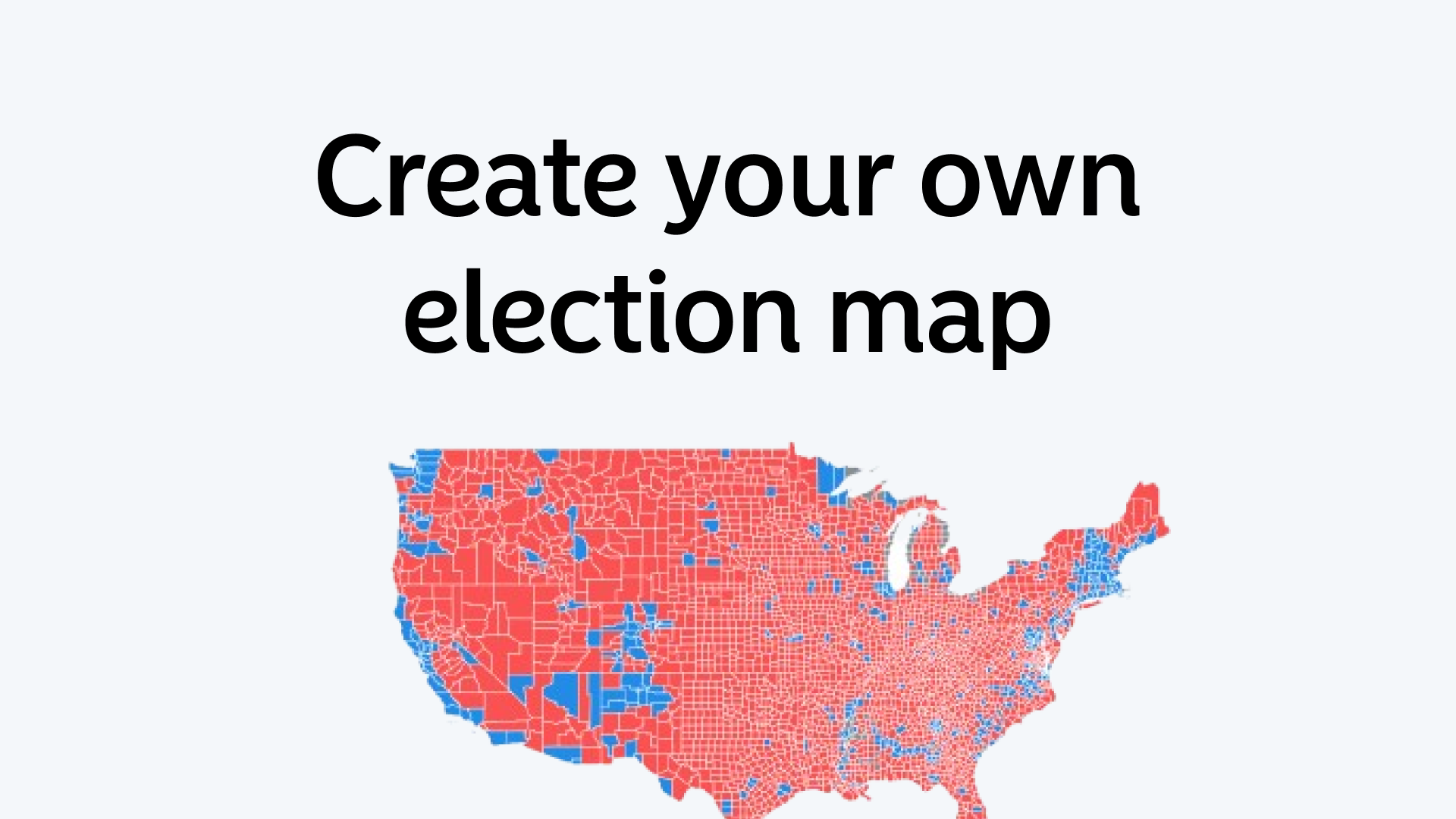
How To Create Your Own Election Map
Election maps help visualize voting results in a clear and interactive way.
With Atlas, you can create your own election map without needing coding skills. Whether you're tracking national elections, local polls, or even internal organization votes, Atlas makes it simple.
Why Use an Election Map?
Election maps provide an easy way to see voting patterns.
Instead of looking at raw numbers, maps help identify trends. You can spot regional preferences, voter turnout, and political strongholds at a glance.
These maps are useful for:
- News agencies covering elections
- Political analysts
- Students studying electoral trends
- Local governments and organizations
With Atlas, anyone can create a custom election map quickly.
Getting Started with Atlas
Atlas is a browser-based GIS platform, meaning you don’t need to install any software. Just open your browser, log in, and start mapping.
Here’s what you need to begin:
- Election data – This can be results from an official source or your own dataset.
- A geographic reference – This could be country boundaries, state lines, or local districts.
- An Atlas account – Sign up or log in to start creating.
Step-by-Step: Creating Your Election Map
1. Import Your Election Data
Start by uploading your data.
Atlas supports CSV, GeoJSON, and other standard formats. Ensure your dataset includes:
- Region names or codes (e.g., state names, county FIPS codes)
- Vote counts or percentages for each candidate or party
2. Add a Base Map
Atlas provides several map styles. Choose one that fits your needs:
- Basic – Clean and simple for easy analysis
- Satellite – For a realistic view
- Dark mode – Great for presentations
3. Link Data to Geography
This step matches your election results to geographic boundaries.
Atlas will automatically align the data if region names match. If not, you can manually adjust or join datasets within the platform.
4. Style Your Map
Customize the colors to highlight voting results.
Common styles include:
- Red vs. Blue for two-party elections
- Gradient shading to show vote percentages
- Diverging colors for multi-party elections
Atlas lets you adjust transparency, borders, and labels for better clarity.
5. Add Interactive Elements
Make your map clickable and interactive.
With Atlas, you can:
- Show vote breakdowns with interactive charts
- Add pop-ups with candidate details
- Enable filtering by party or voter turnout
This makes the map more engaging and useful for viewers.
6. Share Your Map
Once you're satisfied, share your election map:
- Embed it on a website
- Share a direct link
- Export as an image for reports and presentations
Atlas allows for public or private sharing, so you control access.
Tips for a Great Election Map
- Keep it simple – Avoid too many colors or labels that make it confusing.
- Use clear legends – Help viewers understand the data at a glance.
- Update in real-time – If tracking a live election, refresh the data as results come in.
- Check for accuracy – Ensure the data is correct before publishing.
Election maps make it easy to understand voting trends.
With Atlas, you can create a professional and interactive map in minutes. Try it out and bring election data to life.