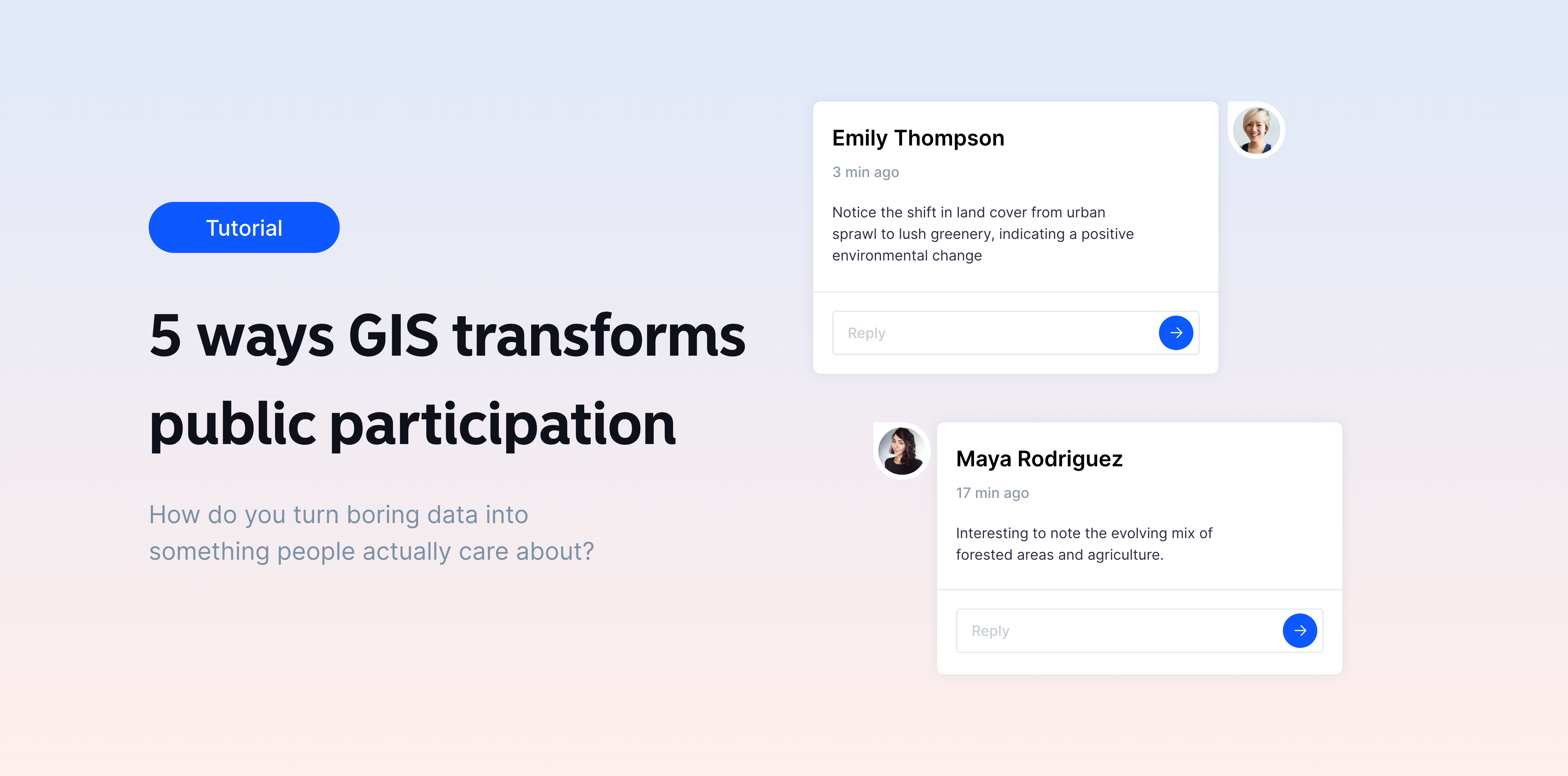
How do you turn boring data into something people actually care about?
You turn it into a map 🗺️
That’s exactly what Atlas does. It makes public data simple, visual, and interactive. Anyone can jump into a browser and instantly start exploring information that affects their community. No need for special tools or training. Just a click and you’re in.
Here’s how Atlas is transforming how communities get involved:
1. Making data visual and easy to understand
Spreadsheets and charts? No thanks. Most people don’t have the time (or patience) to dig through raw data. Atlas changes this by turning complex datasets into easy-to-read maps.
For example, if a city is planning a new park, Atlas shows how it’ll impact nearby areas—roads, homes, green spaces. Instead of just reading reports, people can interact with the map to see how the park might affect them.
2. Simplifying map sharing
Ever tried to open a map only to find you need to download software? Annoying, right?
With Atlas, maps are just a link away. No special downloads. No complicated steps. Anyone with internet access can instantly view and interact with a map.
Say the city’s working on a new housing project. They can share the plan through a link, and residents can explore it on their phone or computer, no extra hassle.
3. Encouraging two-way communication
Public participation isn’t just about looking at a map. It’s about sharing thoughts.
With Atlas, people can do more than just view—they can interact and provide feedback directly on the map. Have concerns about a new project in your area? Drop a comment pin right on the spot.
People can pin their thoughts on specific locations, starting real discussions with others. City officials can then respond in real-time, making the process more interactive and productive.
This creates real conversations between residents and planners. No more one-way communication.
4. Adding context with annotations
Maps in Atlas aren’t just pretty pictures. They come with context.
Planners can add notes, images, and links to explain key points. For example, on a flood risk map, they can highlight areas most at risk and explain why. This helps people understand the ‘why’ behind decisions.
5. Real-time collaboration and updates
Feedback doesn’t have to wait. With Atlas, maps can be updated instantly. During meetings, planners can adjust maps based on feedback, and the changes are visible to everyone in real-time.
No more waiting for updates weeks later. Everything happens live, keeping everyone on the same page.
With Atlas, maps aren’t just tools—they’re conversation starters. They help communities engage, give feedback, and actually see how their input makes a difference.
Pretty cool, right? 😎