Create choropleth maps
Use Atlas to create shaded maps that represent data visually by geographical areas

What is a choropleth map?
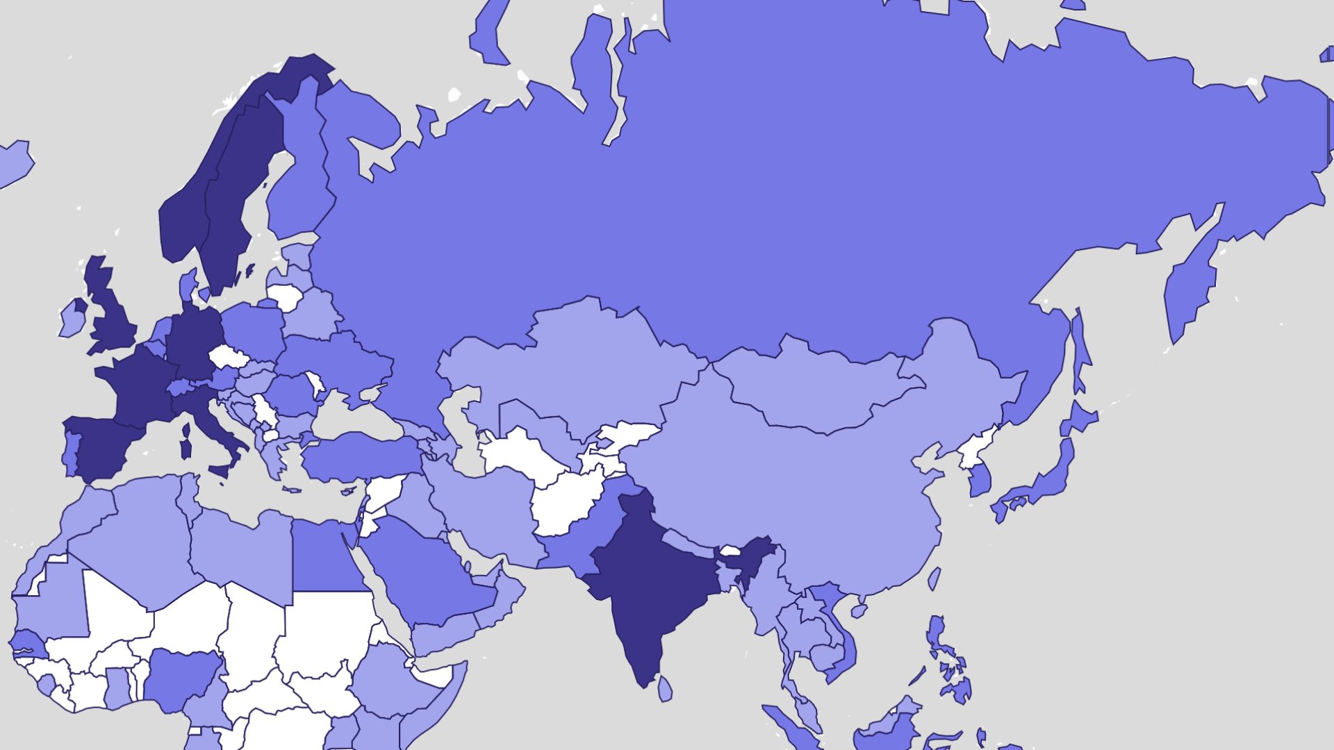
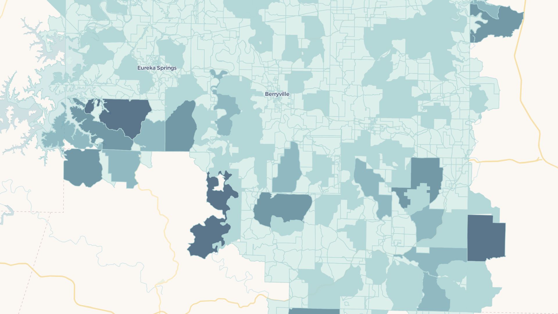
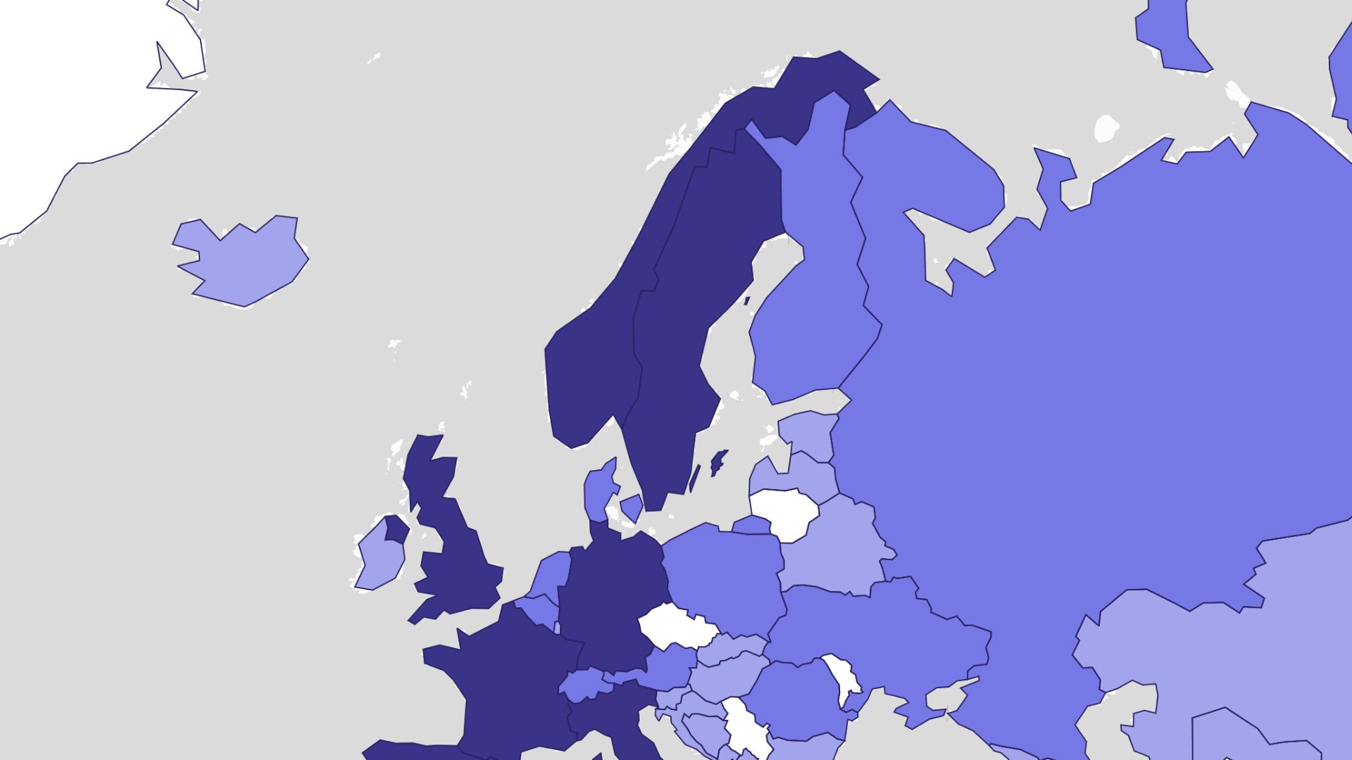
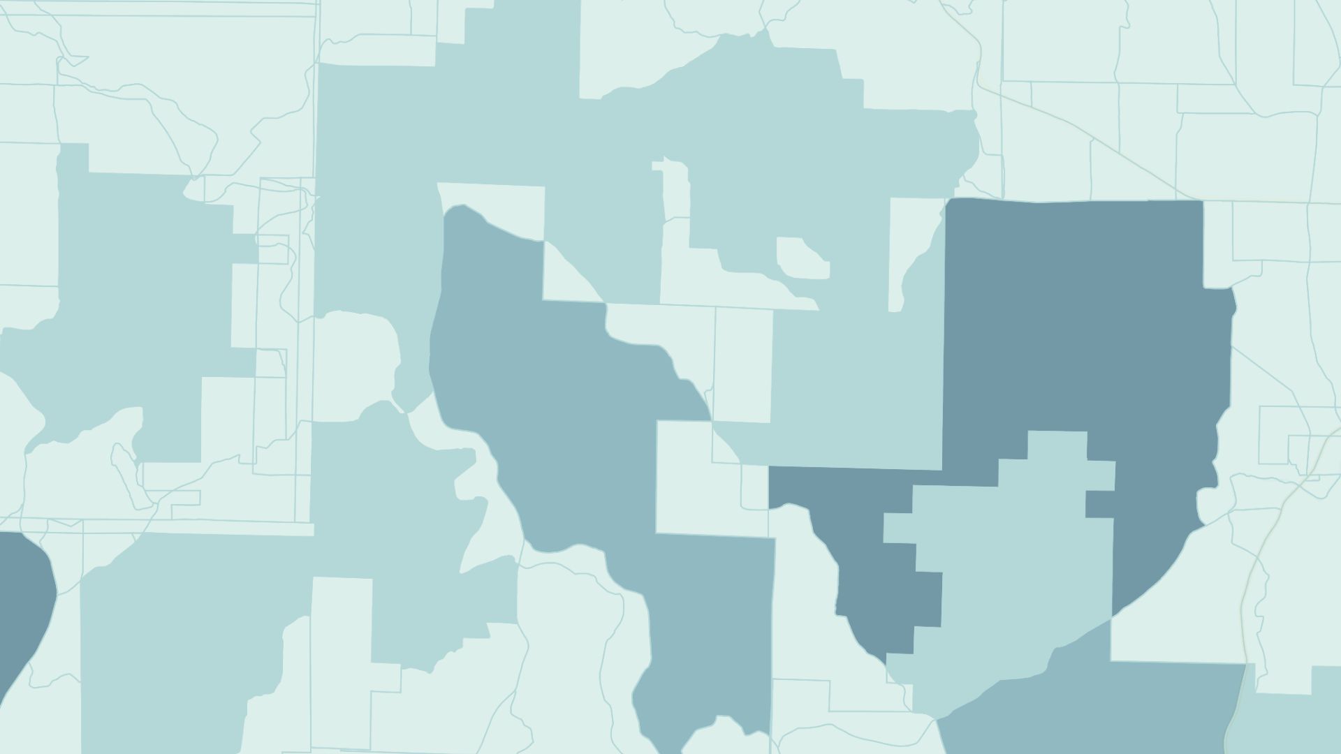
A choropleth map uses color shading to represent data values across geographical areas. It helps identify trends and patterns, such as population density, income levels, or election results, by making the information visually clear.
Create your first choropleth map

Examples of choropleth maps
Population density
Show areas with higher or lower population counts
Income distribution
Visualize regions by income brackets or economic status
Election results
Color-code regions based on voting outcomes
How to create choropleth maps?
Upload your data
Add your geographical data with value fields for mapping.
Set boundaries
Choose administrative boundaries like states, counties, or zip codes.
Choose color scales
Apply a gradient to represent data intensity.
Publish and share
Save your map and export or share it with stakeholders.
Why choose Atlas for choropleth maps?
Atlas provides robust tools to create detailed choropleth maps with ease.
Custom gradient control
Adjust color ranges to emphasize key data points.
Data filtering
Filter maps based on specific criteria or time periods.
Update data
Replace existing data by uploading new datasets.
Multi-layer integration
Combine choropleth maps with other datasets for deeper analysis.
Interactive visualization
Hover over areas to see detailed data in pop-ups.
Export options
Download maps in high quality for reports or presentations.
Frequently asked questions
Learn more about creating and using choropleth maps.
