Not all maps are created equal.
The way we project the round Earth onto a flat surface changes how we see the world, and it’s not just about aesthetics. It affects how countries are sized, how regions are perceived, and how accurate our maps really are.
This guide breaks down how projections like Mercator distort reality, what alternatives exist, and how modern tools like Atlas let you adjust projections, basemaps, and even switch between 2D and 3D to better represent the world.
What Is a Map Projection?
Map projections are methods of representing the three-dimensional Earth on a flat surface.
Since the Earth is round, every projection introduces some distortion in:
- Area
- Shape
- Direction
- Distance
The question is, what do you want to preserve, and what can you sacrifice?
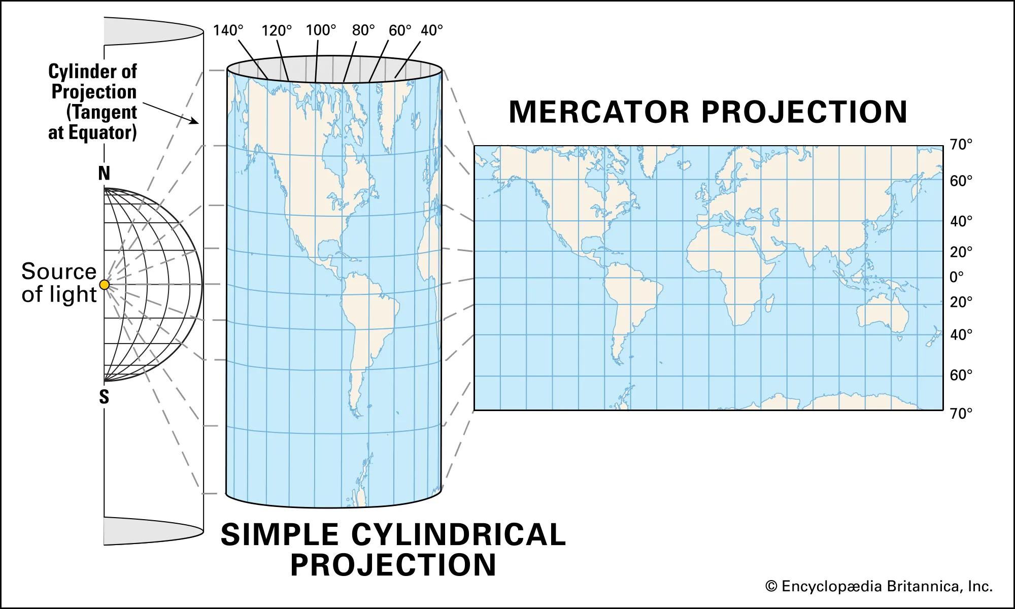
The Mercator Projection: Great for Sailing, Bad for Scale
The Mercator projection, created in 1569, preserves angles and direction. That’s why it was perfect for navigation.
But it badly distorts the size of landmasses the further you get from the equator.
Here’s what gets skewed:
- Greenland looks nearly the size of Africa (Africa is actually 14x bigger)
- Europe appears larger than South America, but it's not
- Canada and Russia seem massive, until you move them closer to the equator
Want More Accurate Alternatives to Mercator?
If you're building educational or analytical maps, here are better projections:
| Projection | Preserves | Distorts |
|---|---|---|
| Peters | Area | Shape |
| Robinson | Balance of area/shape | Specific measurements |
| Goode's Homolosine | Area | Shape + visual continuity |
These projections aim to represent country sizes more fairly, even if they distort shape or continuity.
The True Size of Countries
Tools like The True Size Of let you drag countries across the globe to compare their actual sizes.
This brings some surprises:
- Russia shrinks dramatically near the equator
- Australia balloons compared to Greenland
- Brazil is larger than most people realize
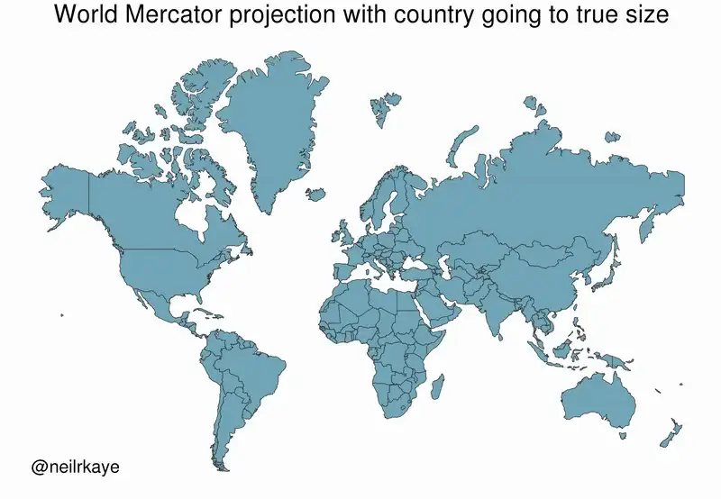
Why this matters:
Maps shape how we perceive power, relevance, and identity. When the global south appears smaller, it subtly shifts our worldview.
Why Mercator Is Still Everywhere
Despite its flaws, Mercator is the default in many digital maps. Here’s why:
| Reason | Explanation |
|---|---|
| Navigation | Straight lines stay straight |
| Familiarity | People expect it |
| Performance | Easy to tile for web maps |
| City-level accuracy | Distortion is minimal when zoomed in |
Show Your Map on Your Terms with Atlas
With Atlas, you’re not stuck with one projection or view.
You can:
- Change the map projection to better reflect the true size of countries
- Switch basemaps to focus on context, terrain, or data visibility
- Toggle between 2D and 3D views, depending on what you want to show
All in your browser. No installations. No exports.
🎥 See It in Action
Watch how quick it is to adjust map settings in Atlas:
Final Thoughts
The Mercator projection helped early navigators, but today, it can skew our understanding of the world.
Modern mapping tools should support accuracy and clarity, not just tradition.
Atlas gives you the control to show the world how it really looks.