Layers are the backbone of any GIS (Geographic Information System) platform, and Atlas is no different.
The way you organize layers can dramatically impact how useful your maps are. Poorly organized layers can confuse the viewer, while a well-structured layout makes your data clear and easy to interpret.
In this guide, we’ll look at how to efficiently organize layers in Atlas, focusing on best practices, tips, and how to make the most out of the tools available.
What Are Layers?
In a GIS platform like Atlas, layers are the individual pieces of your map. Think of them as transparent sheets stacked on top of each other. Each layer holds specific data.
For example, you might have one layer for roads, another for rivers, and another for population density. When combined, they create a complete picture of your geographic data.
Why Organizing Layers Matters
When working with multiple layers, how you arrange them determines how the map looks and functions. If layers are out of order, important details could be hidden behind less relevant data.
For example, imagine you’re mapping wildlife migration and land use. If you don’t organize these layers properly, roads and buildings could obscure migration paths, making your analysis less effective.
By organizing your layers carefully, you ensure that each piece of data is visible and understandable. The goal is to help users quickly grasp the key information.
Best Practices for Layer Organization
Here are some best practices to follow when organizing layers in Atlas:
1. Set Layer Priorities
Decide which layers are the most important to your map’s purpose. Layers with key information should be on top, while less important layers should be placed lower.
For example, if you're analyzing the spread of wildfires, the fire zones should be placed above vegetation types. You don't want critical fire data to be hidden beneath trees and forests.
2. Use Logical Grouping
Grouping similar layers together makes it easier to manage them. For instance, if you’re working with environmental data, you might have one group for natural features (rivers, mountains) and another for man-made structures (roads, buildings).
Atlas allows you to create layer groups, which is particularly useful for turning multiple layers on and off at once.
3. Order Layers by Transparency
Some layers will need to be more transparent than others. Setting transparency levels correctly helps to avoid overlap or clutter, especially when layers contain similar data.
For example, population density might be shown as a semi-transparent layer over a map of city boundaries. This ensures that you can still see the boundaries, but the density data remains clear.
4. Think About Zoom Levels
Different layers should be visible at different zoom levels. Atlas allows you to set the zoom level at which layers appear.
For example, a country-level map might display state boundaries at a lower zoom level, but as you zoom in, it will show detailed street maps and local data. This approach prevents your map from becoming overcrowded when zoomed out.
5. Use Symbols and Colors Wisely
Colors and symbols are powerful tools when organizing layers. Each layer should have a distinct color or symbol set that doesn’t confuse the user. For example, you wouldn’t want to use similar shades of blue for rivers and roads, as it would be hard to tell them apart.
When choosing symbols, make sure they are relevant. For instance, using a fire icon for wildfires and a tree for forested areas helps users quickly understand what they’re looking at.
Tools in Atlas to Help You Organize Layers
Atlas offers several tools to help you organize layers efficiently. Here are some of the key ones:
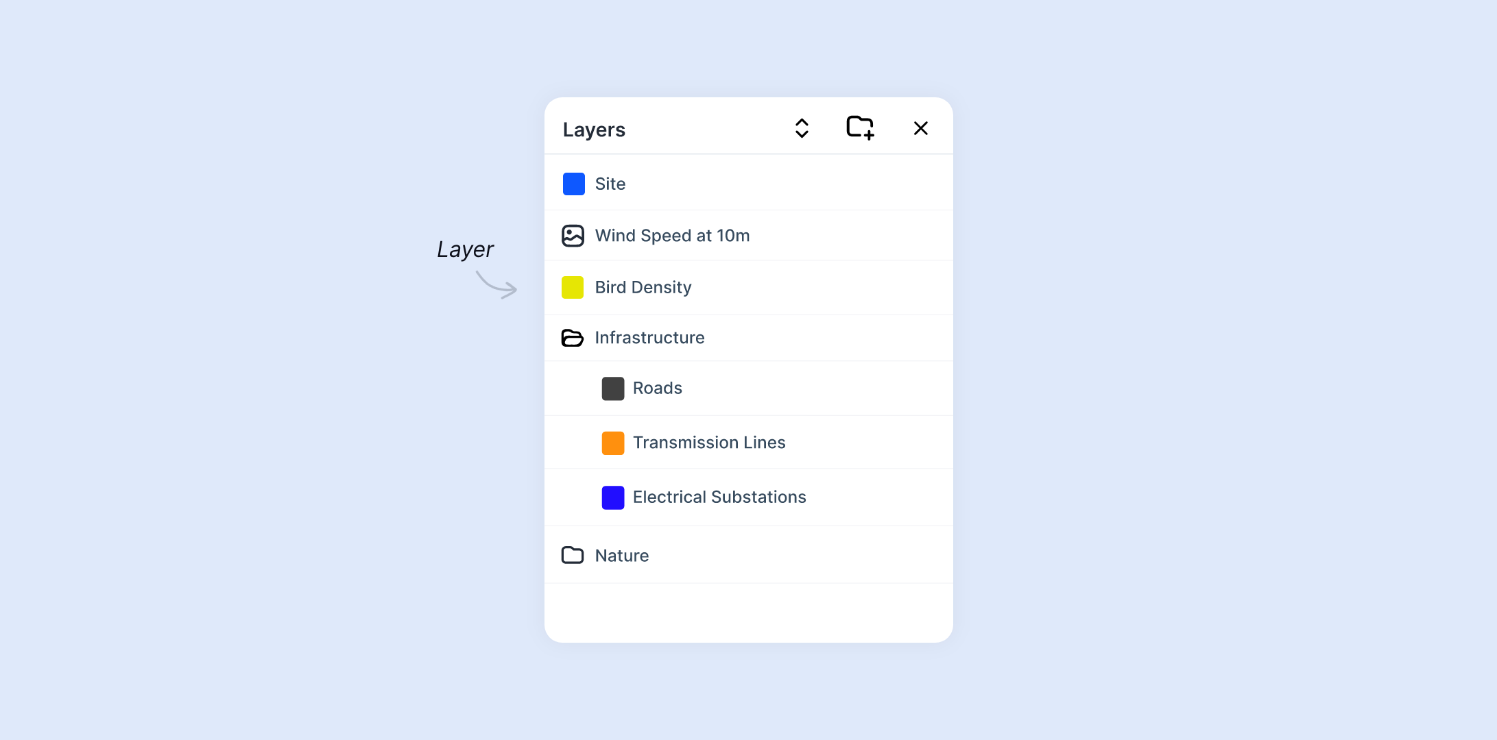
1. Layer Panel
The Layer Panel is where you control all the layers on your map. It’s a straightforward interface that lets you turn layers on or off, reorder them, and adjust settings like styling.

The panel also allows you to rename layers, which is helpful when working with multiple datasets. Clear and descriptive names make it easier to manage the layers.
2. Layer Grouping
Atlas allows you to group layers together. This is useful when you’re working with large datasets or different categories of information. Grouping lets you keep related layers together, making it easier to toggle them on or off.
For example, if you’re creating a map of urban development, you could group all your infrastructure-related layers together, like roads, buildings, and utilities. When you want to focus on environmental data, you can easily hide the infrastructure group without having to toggle each layer individually.
3. Drag and Drop Layer Reordering
Reordering layers in Atlas is simple with the drag-and-drop feature. Just click on a layer and drag it to the desired position in the stack. This is especially useful when you want to change the visual priority of layers quickly.
Remember, the top layer in the panel will be displayed above everything else on your map.
4. Layer Settings and Styling
Each layer in Atlas has its own settings that allow you to control how it looks and behaves. You can adjust transparency, set a custom style, or even change the data fields used for display.
For example, if you have a heatmap layer showing population density, you can adjust the color gradient to make the differences between high and low densities more distinct.
5. Zoom-Level Controls
The zoom-level control allows you to specify at what zoom levels certain layers will appear. This keeps your map uncluttered when zoomed out and reveals more detail as you zoom in.
For instance, you may want roads and street names to appear only when zoomed in to a neighborhood level, while city boundaries can be visible from a higher zoom level.
Common Mistakes to Avoid
When organizing layers, some common mistakes can limit the effectiveness of your map. Here’s what to watch out for:
1. Layer Overload
Too many layers can make your map overwhelming and hard to read. Users should be able to interpret the data without feeling confused. Avoid cluttering your map with too many details at once.
Instead, group similar layers and use the visibility toggle to show only the most relevant information at a given time.
2. Poor Color Choices
Choosing similar or clashing colors for different layers can confuse viewers. Make sure each layer is clearly distinguishable by using contrasting colors. Also, avoid using too many bright colors, as they can make your map look chaotic.
3. Inconsistent Symbols
Using symbols that don’t relate to the data they represent can lead to confusion. Always use symbols that are intuitive and easy to recognize. For instance, a hospital should be marked with a cross or medical symbol, not a generic shape.
4. Ignoring Layer Transparency
Failing to adjust transparency can lead to key layers being hidden behind others. Make sure layers that contain important data are not fully opaque, especially when stacked on top of other layers.
Tips for Advanced Layer Management
Once you’ve mastered the basics of layer organization, you can take things a step further with these advanced tips:
1. Use Data-Driven Styling
Atlas lets you style layers based on the data they contain. For example, you could color-code regions by population size, or use varying line thickness to show road hierarchy (freeways vs. local streets). This makes it easier to spot patterns and trends in your data.
2. Layer Interactions and Pop-ups
In Atlas, you can enhance user interaction by adding pop-ups to your layers. When users click on a feature in a layer, a pop-up can display additional information such as statistics, descriptions, or links to external data.
For example, in a city map layer showing public parks, clicking on a park could bring up details about its size, facilities, and hours of operation. This adds depth to your map without cluttering it visually.
Make sure your pop-ups are concise but informative, and test them for ease of use. Avoid overcrowding the pop-up window with too much information at once.
3. Combine Raster and Vector Layers
Raster and vector data serve different purposes in a map, and combining the two can give you a more comprehensive view. Raster data is pixel-based and useful for showing continuous data like elevation, satellite imagery, or temperature. Vector data is point, line, or polygon-based and better suited for precise features like roads, boundaries, and points of interest.
For example, you might have a raster layer showing topography and vector layers displaying hiking trails and campsites. By combining these, you give users a complete picture of the terrain and the facilities available, providing both context and detail.
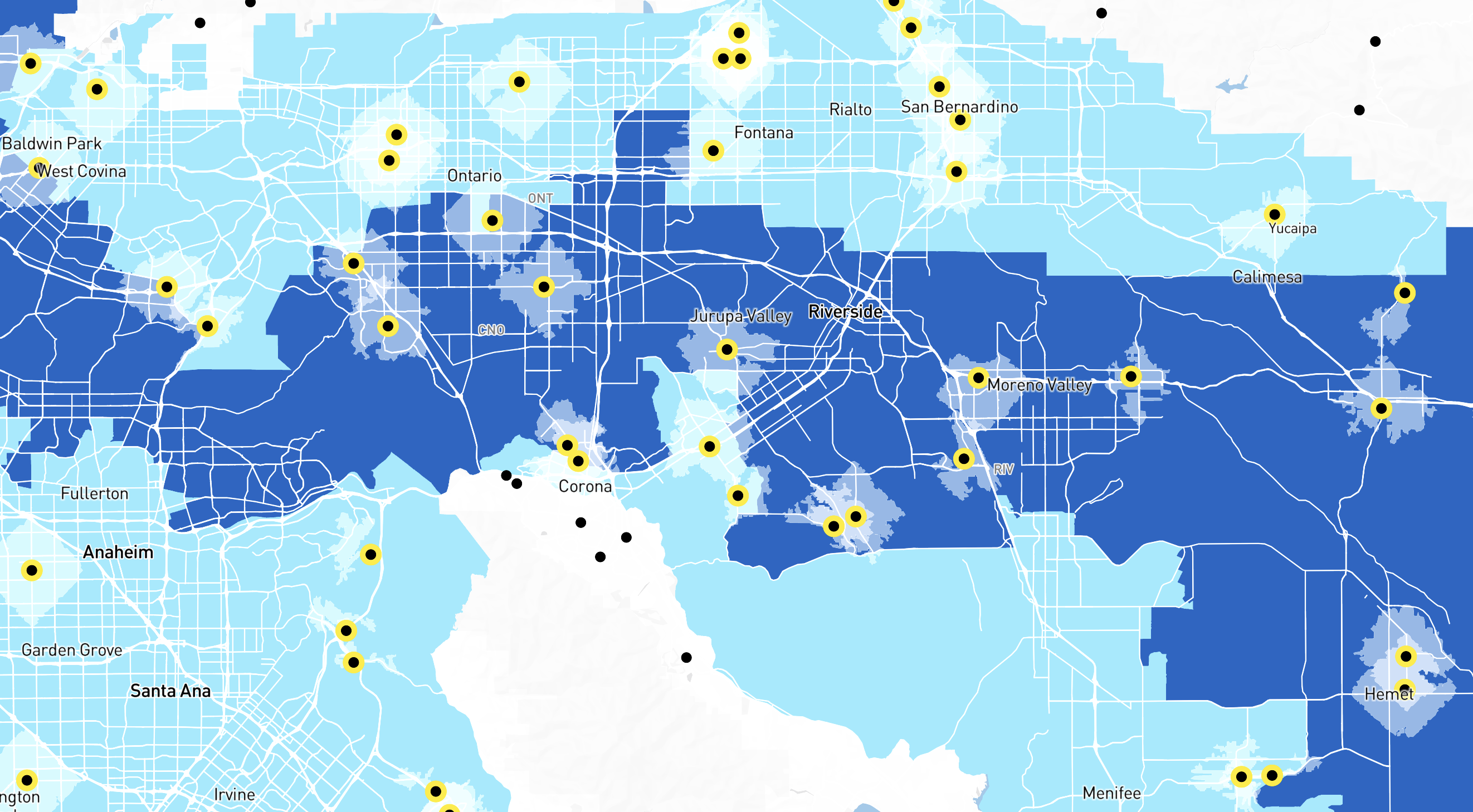
4. Heatmaps and Data Density Layers
When dealing with large datasets, such as population or traffic data, using a heatmap is an excellent way to show data density. Instead of individual points, heatmaps aggregate data into a color gradient, making it easy to see where data is concentrated.
In Atlas, you can easily transform any point-based dataset into a heatmap. Adjust the radius and color ramp to fine-tune the visual impact. For example, a heatmap showing crime incidents in a city can highlight hotspots, allowing viewers to focus on areas with the highest activity.