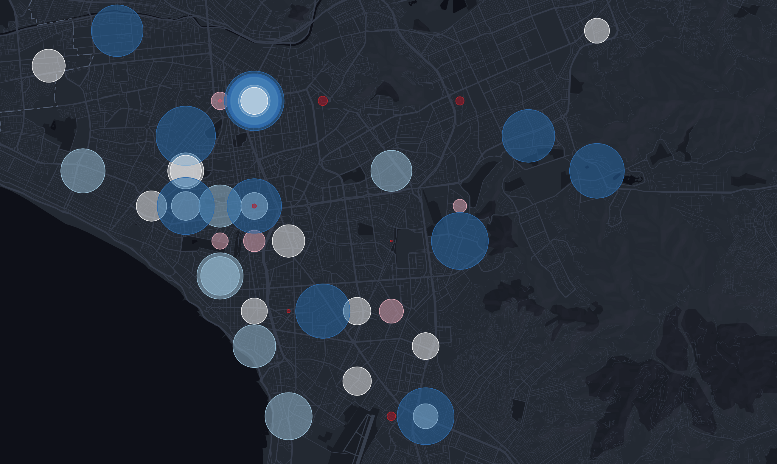
Imagine you're looking at a map showing the population of cities across a country. Instead of trying to decode different shades of color or intricacies of boundaries, you see simple symbols—say, circles—that grow larger or smaller based on the city's population.
This is the essence of Proportional Symbol Map.
They use symbols, which can vary in shape and size, to represent data quantities in specific geographic locations. This method makes it easier to spot high-density areas, understand disparities, and interpret data at a glance.
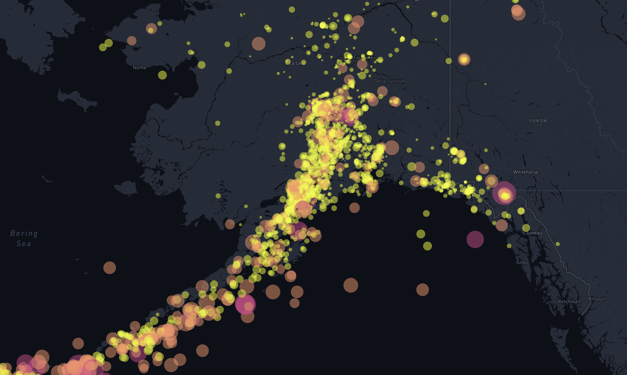
These maps are not just about aesthetics; they're a powerful analytical tool. By abstracting data into visual symbols, they allow us to quickly grasp complex spatial relationships and make informed decisions based on geographic patterns.
Why Proportional Symbol Map Matter
Within GIS, data visualization is key.
Proportional Symbol Maps excel in this area by offering a blend of simplicity and depth. They transform raw data into engaging visuals, making it easier for both GIS professionals and stakeholders to understand spatial patterns and data distributions.

Moreover, proportional symbols can seamlessly integrate with other thematic maps, such as choropleth maps, enhancing their descriptive power.
The core advantage of employing a proportional symbol map lies in its capability to vividly depict the spatial distribution of quantitative data, offering a clear, visual representation of how values vary across geography. This makes it an invaluable resource for conveying intricate data patterns in a straightforward and visually appealing manner.
How to Create Your Own Proportional Symbol Map
Contrary to what one might think, creating a Proportional Symbol Map doesn't require advanced GIS skills. With modern GIS software becoming more user-friendly, anyone can create these maps with a bit of guidance.
Step-by-Step Guide
- Choose Your Software: Begin with accessible GIS software like Atlas or ArcGIS Online, both of which offer robust tools for creating Proportional Symbol Map
- Select Your Data: Identify the dataset you wish to visualize. This could be quantitative data like population figures, sales numbers, or any other metric that can be represented spatially
- Prepare Your Map: Import your dataset into the GIS software. This sets the stage for your visualization.
- Generate Symbols: Utilize the software’s tools to assign symbols to your data points. The size of each symbol will be proportional to the data value it represents, with settings available to adjust the minimum and maximum sizes.
- Customize Your Map: Fine-tune the appearance of your map by adjusting symbol colors, adding labels, and defining a clear legend. This customization enhances readability and visual appeal.
- Analyze and Interpret: With your map complete, you can now use it to identify trends, anomalies, and patterns in your data, offering a new perspective on the spatial dimension of your analysis.
Professional Work with Proportional Symbol Maps
Proportional Symbol Maps are great for a vast array of professional contexts, effectively acting as a catalyst for deeper understanding and strategic action.
In urban planning, for instance, these maps can illuminate traffic congestion patterns, enabling planners to devise more effective traffic management solutions.
Public health officials can use them to visualize the spread of diseases across different regions, identifying outbreak epicenters and directing resources where they are needed most.
For businesses, Proportional Symbol Maps can highlight areas of high market penetration or regions underserved by their services, guiding strategic market planning and resource allocation.
This clarity is indispensable in strategic planning, where understanding spatial relationships and patterns can guide critical decisions, from optimizing resource distribution to enhancing service delivery and beyond.
Proportional Symbol Maps represent a confluence of simplicity and insight, making them an indispensable tool for anyone working with GIS software. They transform the way we visualize and interpret spatial data, making complex patterns understandable at a glance.