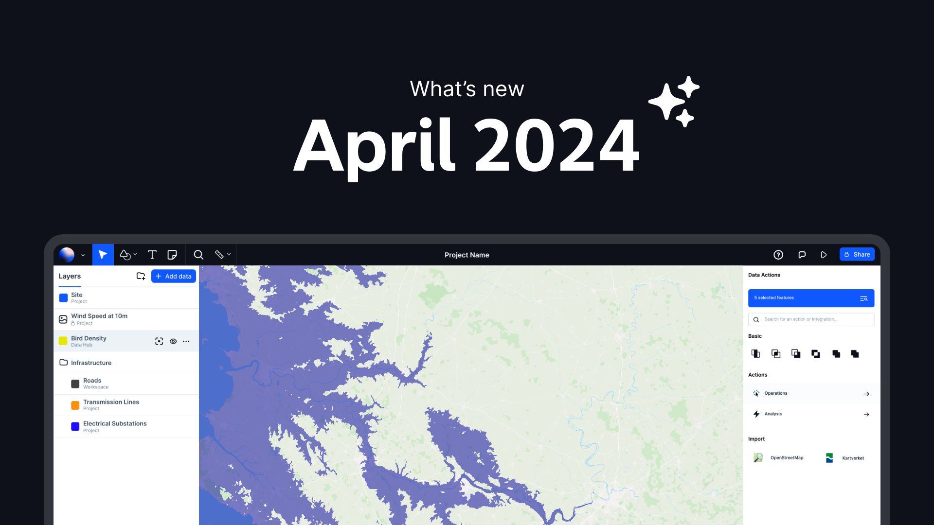
This April, we’ve turbocharged Atlas with a lot of new features to ensure you have the best tools at your fingertips.
Dive into the summary below, and keep reading for a detailed rundown of each enhancement:
Quick Overview
- Data Table Expressions
- Sea Level Rise Tool
- URL Data Upload
- 7 New Map Projections
- Customizable Legends
- Timeline for Rasters
- Enhanced Editing Tools
- Unique Values for Raster Styling
- Satellite Image Import
- Enhanced Raster Display Controls
- Interactive Timeline Widget
Data Table Expressions
Write custom expressions directly within data tables for advanced data analysis and manipulation. This feature allows you to dynamically calculate new data fields and automate complex data transformations, enhancing your analytical capabilities. It provides a powerful way to tailor data processing to specific needs without external software or scripting.

Sea Level Rise Tool
Simulate potential future sea level scenarios to assess risk and plan interventions with our new modeling tool. This tool provides projections based on Digital Elevation Models (DEM), allowing users to visualize the impact of rising sea levels on coastal areas and infrastructure. It is designed to support urban planners, environmental scientists, and policy makers in making informed decisions to mitigate potential damages and implement effective adaptation strategies.
URL Data Upload
Directly upload data sets into Atlas via URLs, making data integration fast and seamless. Upload data with a Google Sheet link, ESRI FeatureServer or any geo files hosted on an URL, e.g. Github or similar.

7 New Map Projections
Access a wider array of map projections to better represent geographic data according to your specific needs. This expansion includes both common and more specialized projections, allowing for accurate visualization and analysis tailored to various geographical scales and contexts.

Users can now easily switch between projections to compare perspectives and derive insights that are crucial for environmental studies, urban planning, and global logistics. This capability not only improves the aesthetic appeal of your maps but also significantly boosts the analytical value they offer, making it easier for professionals across various fields to communicate complex spatial information effectively.
Customizable Legends
Modify and design map legends to match your visual presentation preferences, enhancing readability and context.

This enhancement means you can now edit legend labels to be more descriptive or concise, match specific terminology relevant to your project or audience.
Unique Values for Raster Styling
Style raster layers based on unique data values, enabling distinct visual differentiation of important data points. This feature is particularly useful for creating detailed land cover maps where differentiating between various types of terrain or land use is crucial.

By using this feature, GIS professionals can enhance the clarity and impact of their maps. For example, different vegetation types can be colored distinctly to show biodiversity, urban areas can be highlighted to delineate city boundaries, and water bodies can be styled to stand out from other land features. This level of detail is invaluable in environmental monitoring, urban planning, and resource management, where accurate and easy-to-understand visual data is crucial.
Additionally, the ability to style raster layers based on unique values supports better decision-making and communication. It enables stakeholders and decision-makers to quickly grasp significant details without the need for complex explanations, making it an essential tool for presentations and reports. This functionality not only saves time during the data analysis phase but also during the sharing and collaborative review of geographic information.
Timeline for Rasters
Visualize changes over time with our enhanced timeline functionality for raster data, perfect for environmental monitoring. This tool allows users to track and analyze temporal variations in satellite imagery or other raster datasets, such as vegetation changes, urban expansion, or seasonal fluctuations.
The Timeline for Rasters feature is designed to be intuitive, allowing users to easily navigate through different time points using a slider interface. This functionality not only facilitates the understanding of how specific areas have evolved over time but also aids in predicting future changes based on past trends. It is an invaluable tool for ecologists studying habitat degradation, urban planners monitoring city growth, or disaster response teams assessing damage over time.
Enhanced Editing Tools
Our new vertex manipulation tool allows for smoother and more precise editing of map features. This enhancement makes it easier to adjust shapes and boundaries with higher accuracy, facilitating detailed geographic data management.

We've made vertex selection more intuitive: deleting a vertex now automatically selects the next one in sequence, streamlining the process of simplifying geometries. Additionally, the selected vertex is now highlighted more clearly, reducing errors and increasing efficiency in editing tasks. This suite of improvements not only boosts usability but also empowers you to handle complex editing operations with greater ease and confidence.
Enhanced Raster Display Controls
Adjust the visual properties of raster layers such as brightness, contrast, and saturation to achieve clearer and more detailed imagery. This feature allows users to fine-tune the appearance of raster data, enhancing the visibility of subtle features and differences across the layers.
Satellite Image Import
Easily import and analyze historical satellite imagery to enrich your projects with valuable temporal data. Conduct detailed change detection studies, track long-term environmental changes, and assess historical land use transformations.

Interactive Timeline Widget
Add dynamic, interactive timeline widgets to your maps to display changes and trends over time engagingly. This tool enables users to interactively explore temporal data, such as population growth, climate changes, or infrastructure development, directly within the map interface